Let's Jam
Social Media for Musicians
Context
This was the third and final project for my Google UX Design Certificate Program.
Problem
Playing music with friends is fun, but it’s a challenge to find people who play the right instrument and share your musical taste and skill level.
Solution
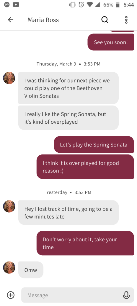
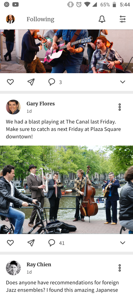
To help musicians connect with each other, I envisioned a social media platform for musicians, combining the traditional feed structure of Facebook with the matchmaking system from dating apps.
User Interviews
Before I began designing a social media solution, I interviewed two of my musician friends from college. By talking to real people, I could:
- Check my assumptions about the social challenges of musicians
- Discover pain points that would-be social musicians face, both on and off social media
- Understand better what “social media for musicians” could mean
- Collect ideas for potential solutions, and avoid common pitfalls
I was surprised how enthusiastic my musician friends were about “social media for musicians,” and how similar their vision was to mine. Based on these two conversations, a social media/matchmaking app looked like a great solution to help musicians connect with each other.
Pain Points
My interviews also helped me to identify specific user problems before I had even started to design solutions:
-
Transparency
Users want to understand the algorithm behind the content they see.
-
Attention Trap
Users don't like when social media apps/sites try to keep them online.
-
Similar Music Taste
Musicians want to find other musicians who share their musical taste.
-
Community Tone
Musicians want their community to be professional but not elitist.
User Personas
Inspired by my interviews and guided by my experience inside the music community, I created two user personas. The goal was to distill the wide variety of needs, desires and behaviors in the music community into two characters, increasing empathy and aiding imagination.
Esteban
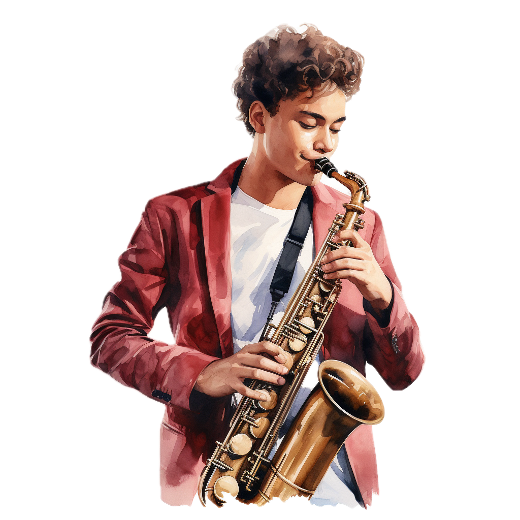
Esteban learned saxophone in high school, and he loves to play Jazz. Unfortunately, his friends don't play instruments. He's looking for a mobile app to find other young Jazz musicians in his town.
“Why is it so hard to find other people my age who want to hang out and jam?”

Maria
Maria is an amateur cellist who wants to get back into playing casual chamber music. She is hoping to find a website that can connect her to some other chamber musicians.
“Yes, I miss playing cello, especially with my friends. But most chamber music programs are just too expensive and too intimidating.”
User Journey Map
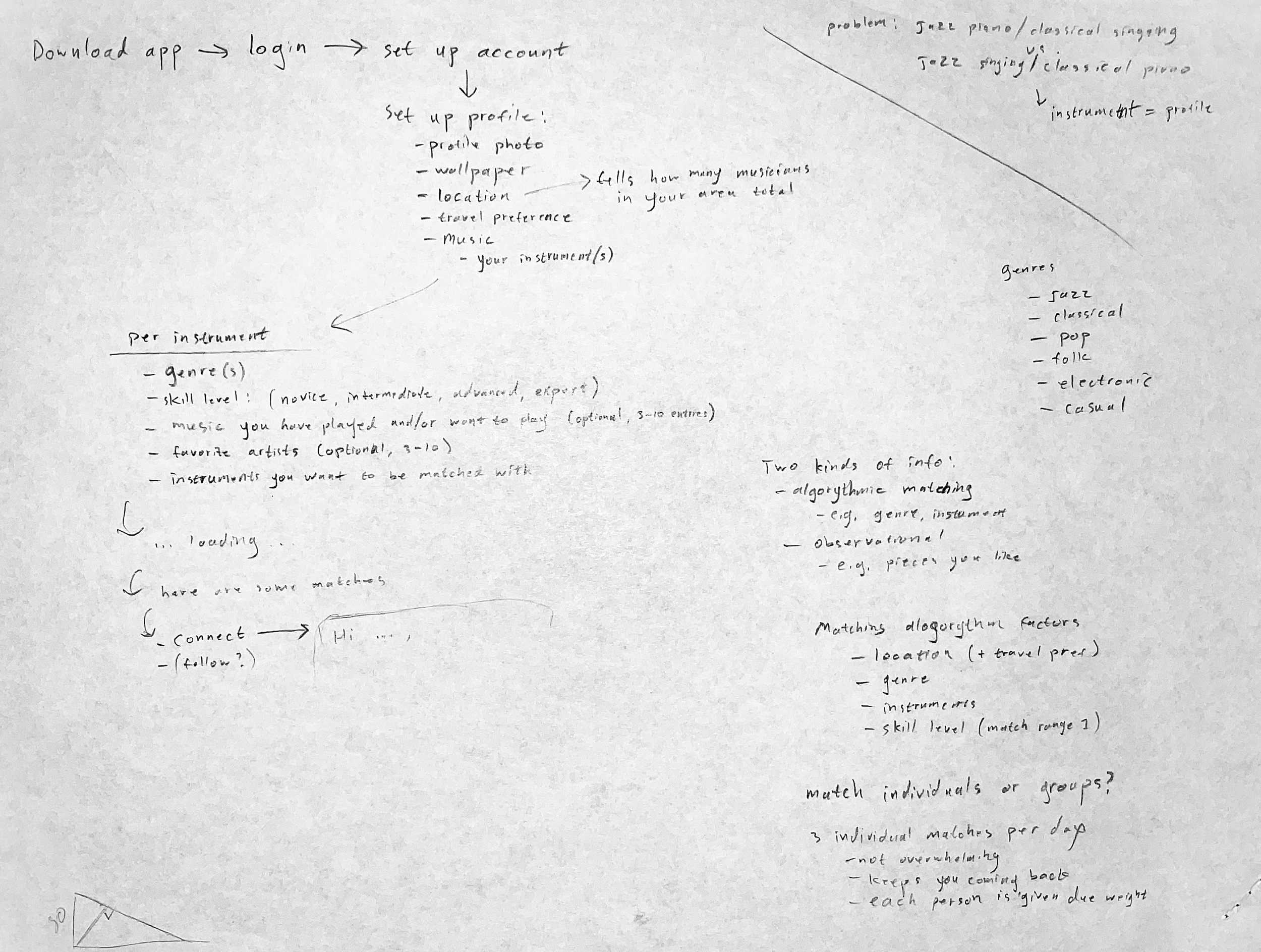
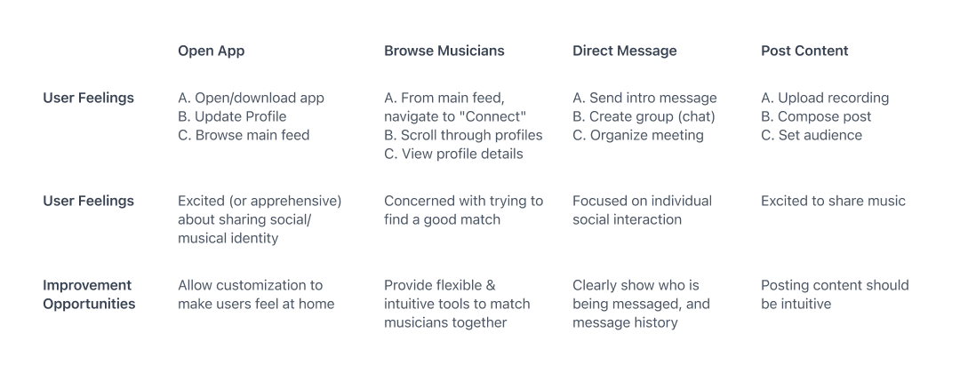
At this point, I needed to think through the step-by-step specifics of how someone would use a social media app for musicians. I needed to map out a user journey.
Three Challenges
As I was creating this user journey map, I discovered three major design challenges. First, I realized it would be difficult to solicit information about the user’s musical taste and ability without being tedious or invasive. Second, I discovered that the matchmaking feature and the feed/post feature were independent. In other words, someone might want to browse or post content, or they might want to make new friends, but there was no reason to assume that one person would be interested in both features, or that most users would use one part of the app before the other. Third, and this was the big one, how was I going to match musicians together?
The Big Challenge
So, how to match musicians with each other?
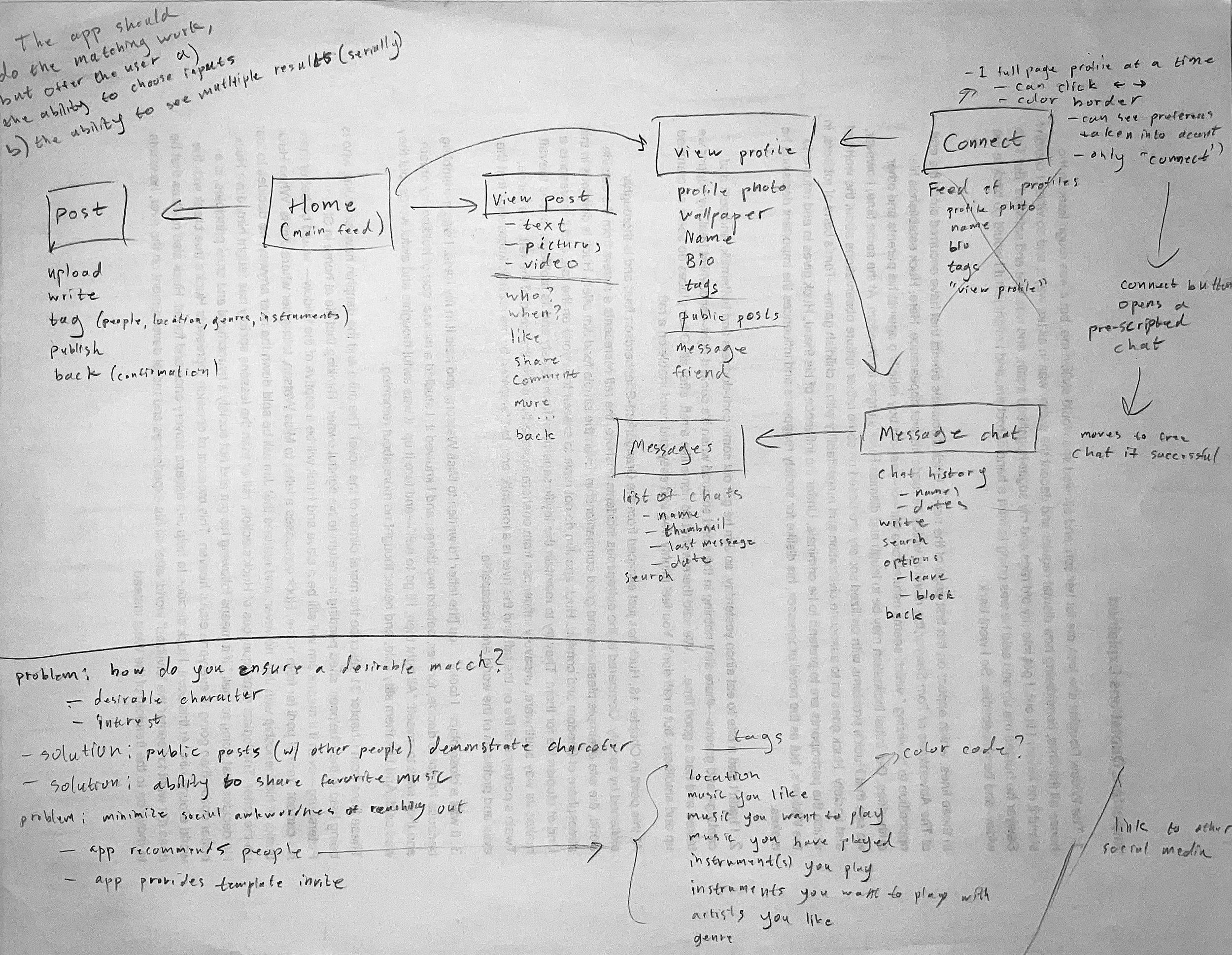
The most direct solution was this: show the user a screen with a selection of other user profiles, curated based on location, musical taste, instrument preference, and musical ability. The user could then select and direct-message the most promising match from among the profiles presented. Immediately, this raised questions:
- Would potential matches be presented in a list all at once? Or discretely, one at a time?
- Would potential matches be limited to one or a few per day, or would they be unlimited?
- Would matching require mutual interest, or could one user direct-message another unsolicited?
- If a user wanted to put together a group of musicians (e.g. to play chamber music, or form a band), how would the app ensure a match between all users?
Preliminary Solutions
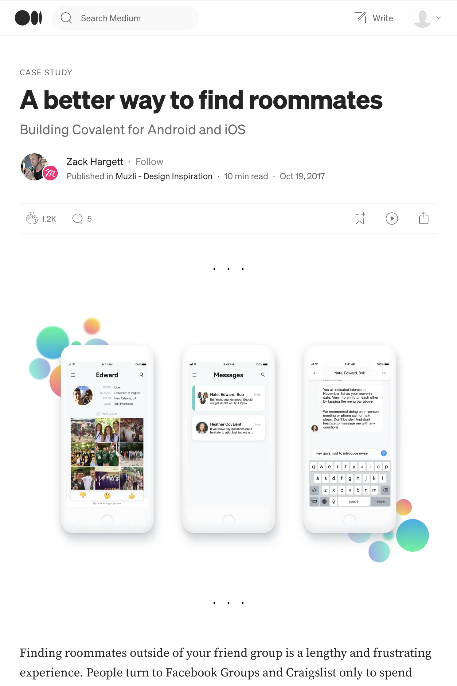
While I was thinking about these questions, I came across a case study for a roommate matching app. The article proved immensely helpful, as they faced similar challenges. Among these challenges, one stood out: how to make reaching out to strangers on the internet comfortable, even automatic. With this challenge in mind, I began to answer the questions I had posed.
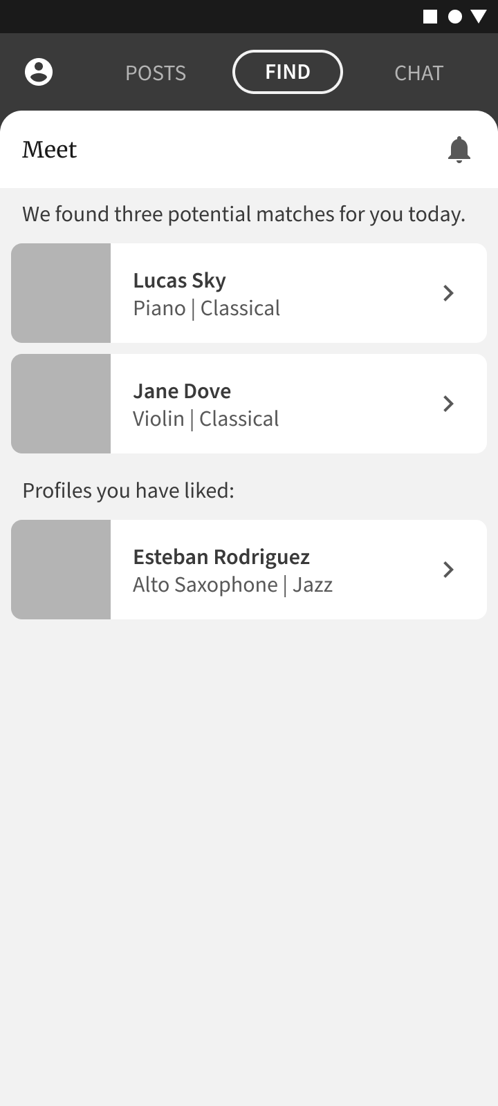
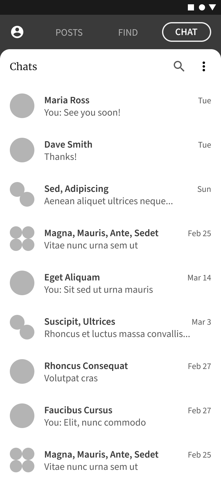
The “connect” tab in the app would show just three potential matching profiles per day. When a user “likes” a profile, it goes into a list of liked profiles. When a mutual like occurs, the two users would be added to each other’s friend lists, and the app would automatically start a direct message between them. As users accumulated friends, they could start group chats with multiple members. This would also allow users to introduce mutual friends to each other.
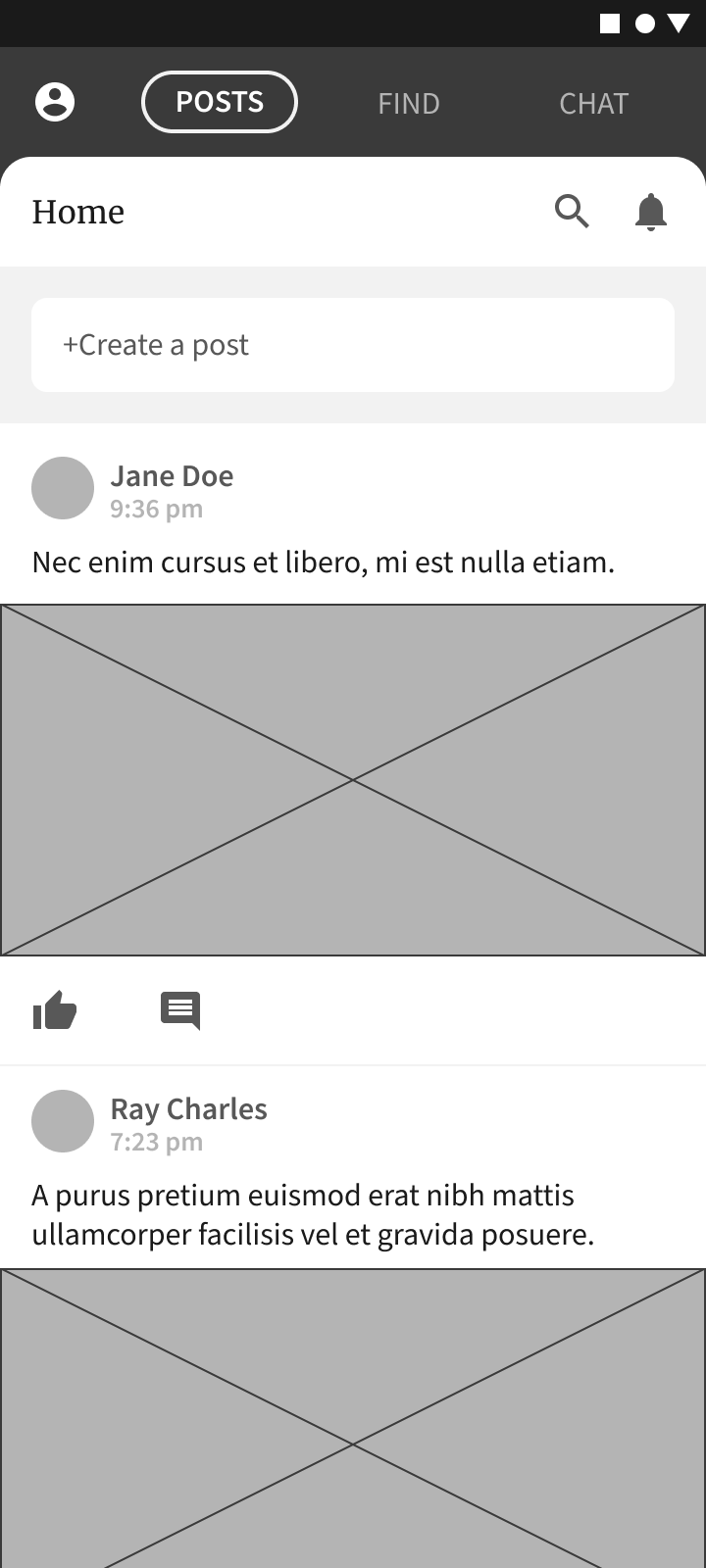
The home feed would show posts of friends by default, but you could “unfollow” friends to hide their posts (like on Facebook). Conversely, all posts would be public by default, so that one user could get a feel for another by looking at their post history. There would also be a way to explore posts from the public on the home feed, filtered by location and musical genre.
Wireframes
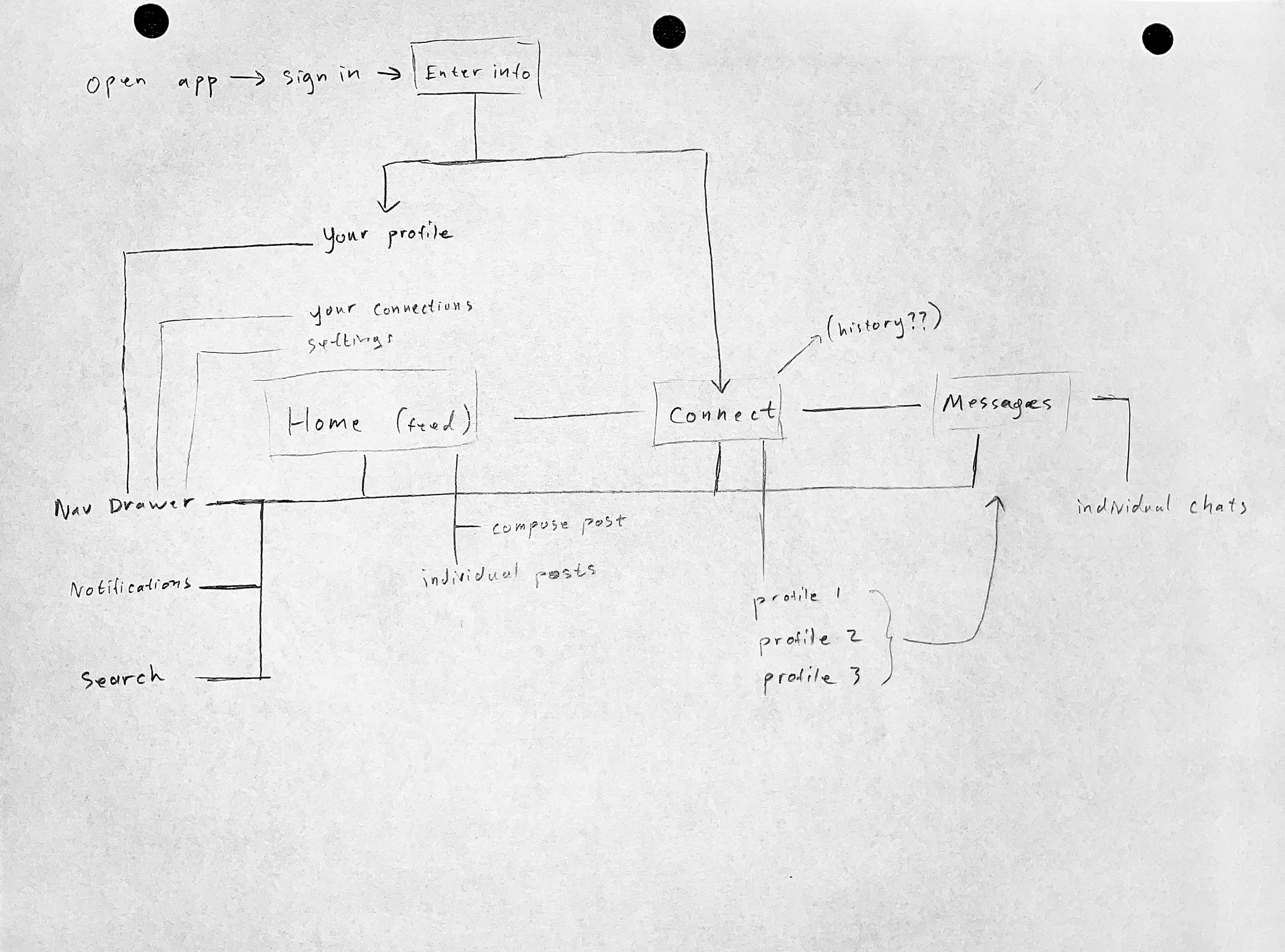
Armed with my ideas, I set out to wireframe the basic skeleton of the app. I decided to stick to a simple, three part structure: the home feed, the matching feature, and a messaging center. I also wireframed out a set of onboarding screens. At the top of my mind was how the app would collect, aggregate and distribute information about each musician and their preferences.
Low Fidelity Prototype
Once I had a set of basic screens, I strung them together in Figma to create a low-fidelity prototype. Try it out below:
Usability Study
I ran a small usability study with three participants. I wanted to know whether the onboarding process was too arduous, whether the overall layout of the app made sense, and whether I had forgotten any essential features.
The study proved useful. I came away with several smaller insights, but I also realized I needed to rethink the onboarding process and the matchmaking system.
Rethinking Onboarding
The onboarding process was not only long and tedious, it was unnecessary. Only a small amount of personal information was actually required to start using the app (to explore and post). Most of the detailed information about each musician was only necessary when trying to match musicians together.
My solution: Let users skip to the good part.
We could get basic information from a third party account (e.g. Google sign in), and allow users to start exploring the app right away. More advanced information could be filled on each user’s profile page as it became relevant. Developing a personalized profile page is a lot more exciting than filling out forms of information.
Rethinking Matchmaking
Rating other musicians is awkward, and too far removed from the goal of actually playing music together.
My solution: Focus on matching intent, not people.
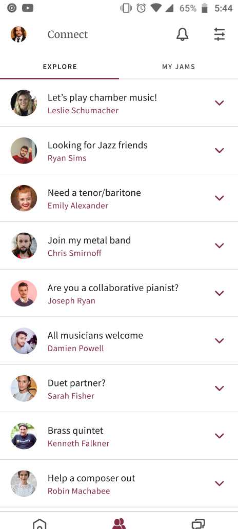
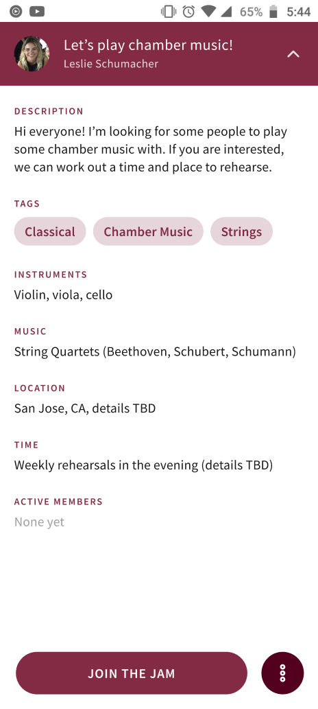
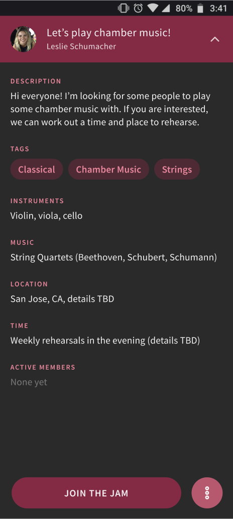
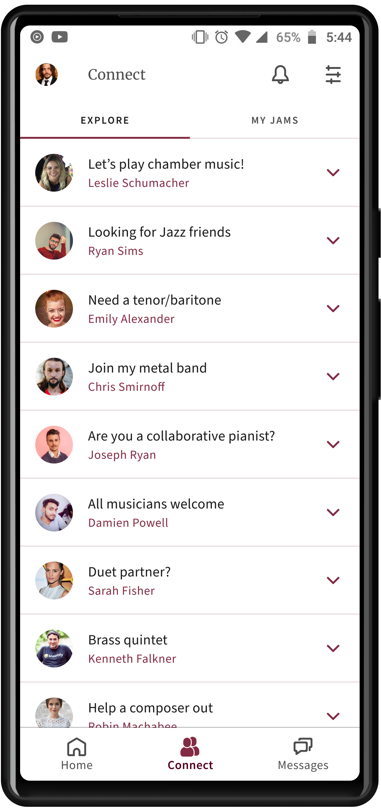
The new system would work like this: users could create open invitations (later termed “Jams”) to play a specific kind of music at a specific location and at a specific time. Other musicians could browse these invitations and “join the jam” if they found one that looked appealing. Once a jam had some musicians in it, the original poster could start a group chat with any or all of the members.
Minor Insights
From the usability study I also gleaned some minor insights related to the app’s UI:
- Users found the names of the navigation tabs confusing.
- The user’s profile page needs to have an edit button.
- The stepper used to help walk the user through initial setup should be expanded and clarified.
I addressed these problems in my new designs.
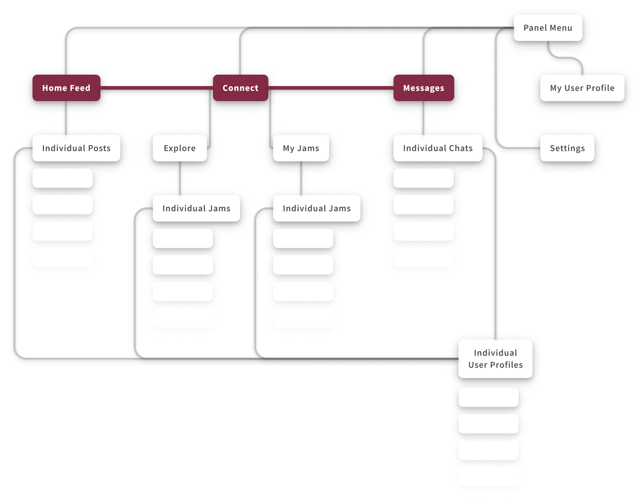
Information Architecture – Updated
The app still had a three part structure (feed, connect, messages), but the matchmaking system was now built around the concept of “Jams” rather than trying to match people directly.
High-Fidelity Design
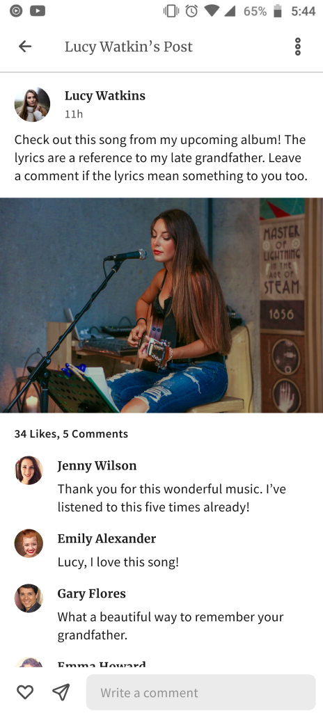
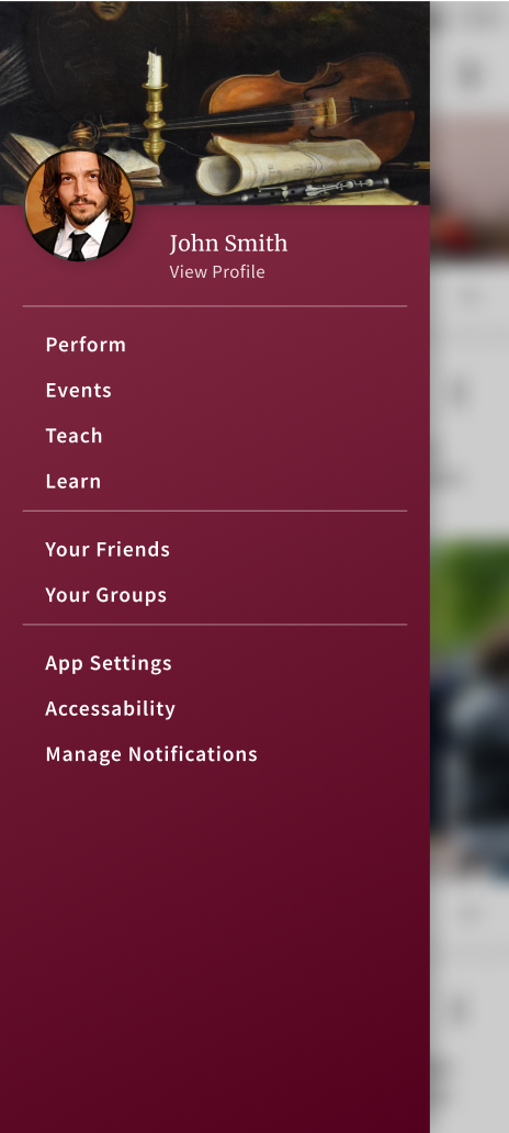
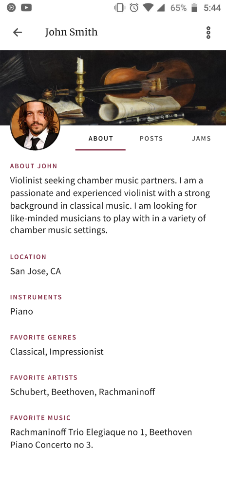
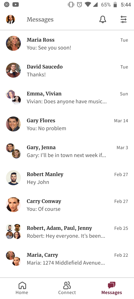
After much experimenting with colors, I settled on a graphical theme. I wanted the tone to be friendly, maybe even exciting, but still be closer to formal than to juvenile. I reworked the whole app in high fidelity, adding in details that I had left out during wireframing, and adjusting my designs based on feedback from my usability study.



Dark Mode
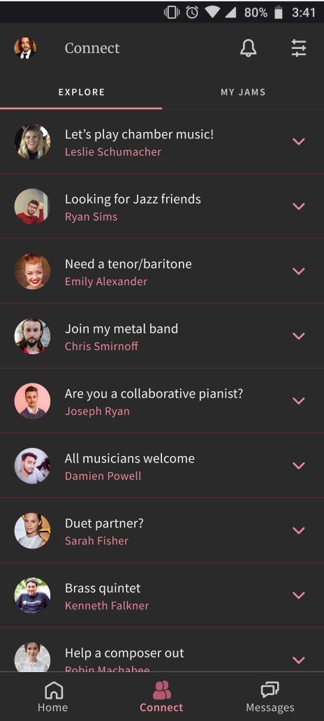
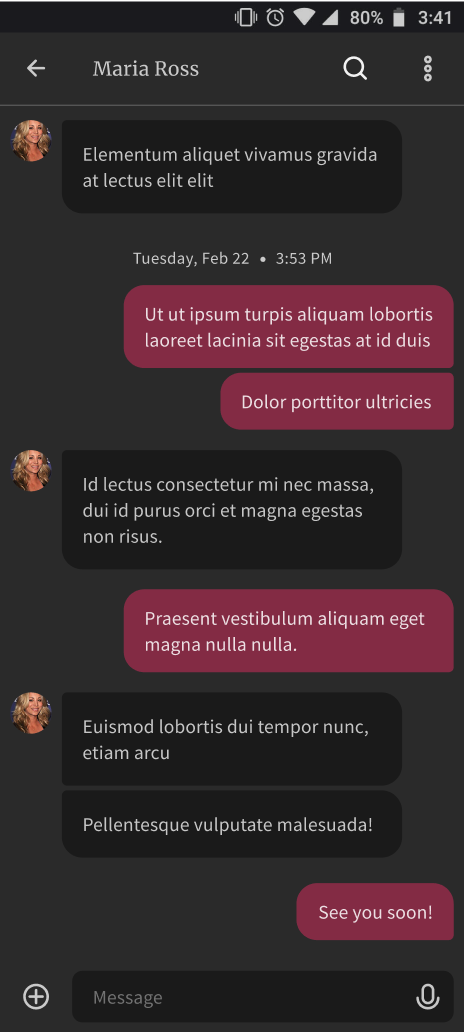
After I had created light-theme designs, I was inspired to create a dark-theme as well. I was careful that UI elements conformed to WCAG accessibility standards for both light and dark themes.
Desktop Designs
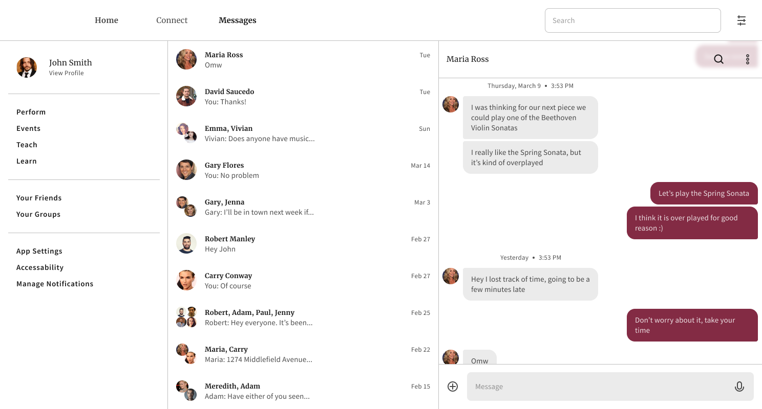
Once I had worked out what the app would look like on mobile, I created designs for a responsive website. I wanted users to be able to use the app on multiple device types.
Project Impact
Over the course of the project, I received multiple comments from study participants expressing their wish to see this app in the real world. If this project reached the app store, people would download it.
Conclusion
Among other things, this project taught me the power of minimizing user choice. When users have to spend time trying to decide how to use an app, it creates friction that makes users want to leave. Good designs anticipate what users want so that they don’t have to spend time thinking.
Despite all I learned and all the designs I created, I still feel like this project is just beginning. If I were to continue working on the project, I would love to:
- Build out more complete responsive web designs.
- Test a high-fidelity prototype
- Nail down the matchmaking system further (it’s still a little rough around the edges)
